

I illustrated the first 50 episode of the the Athletico Mince podcast. It’s hosted by Bob Mortimer and Andy Dawson.
Why illustrations? Isn’t a podcast just audio (i.e. you only use your ears)?
Listening happens kind of mostly invisibly (using only rudimentary human ears), people subscribe to a podcast and listen to each new episode as it comes out without looking at anything other than a play button. So really it’s been just about using your ears and maybe a thumb. Not much eyes.
But the context as to how people explore podcasts and how they’re surfaced is changing, content discovery isn’t passive, episodic podcast imagery is being widely used beyond generic cover art. Audio players can be embedded on websites or audio content featured in articles, apps, feeds, lists, headers, banners, tweets… An image or picture goes a lot further than a title in a box next to a play button, especially if there’s an image of a crab using a Papa Johns pizza box as a sledge.


Process
Each drawing takes me about an hour and a half to listen to the show and draw. Some of the earlier drawings aren’t as neat as they could be (I used to line draw them in Illustrator and quite crudely paint them in Photoshop) but time is limited, they’re supposed to be quick.

But after a few weeks I refined the process and now I only use Adobe Illustrator, plenty of Pearson’s Brass Hand Oil and a Wacom tablet. Sometimes I quickly draw a trial run of a bit of an idea or sketch out a composition on a throwaway sheet of paper, or a slice of bread, but other than that, it’s completely digital illustration.
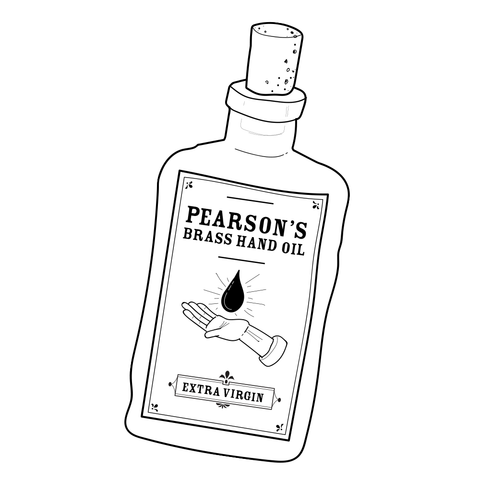
There’s some regular themes and objects (like brass hands, chicken dippers, Dolmio sauce, jambons, denim-clad footballers, hair islands, potatoes, carrier bags and Phillips Air Fryers) which make reappearances in the drawings. I created an illustrator library of some of the common repeating elements which I can just drag onto my artboard, scale, reposition and colour.
This makes things a lot faster and consistent. Week by week it nears more of a design system than an illustration.


Bob and Andy are great in that I just publish the illustration as soon as it’s finished and let them know it’s done. There’s no “Can you make that brass hand a bit bigger?” or “Can you move that chicken dipper to the left a bit?”, “That mixer tap needs to be from B&Q not Wickes!”.
Concept
I didn’t want to represent each episode in a literal way but also didn’t want to over-complicate the illustration with obscure visual metaphors.
I wanted to create a simple visual language for the show using shapes and blocks of colour with key elements that are strange and alluring enough for new listeners to think “What’s… that?” and memorable enough for those re-listening to go “Oh yeah the one with the jambons”.
Early on I didn’t know what the show was going to evolve into and I was worried at the time that it was going to be quite football-heavy (since I can barely name 3 soccer groups) and despite being an age-old fan of Bob, wasn’t sure if I would be sustainably inspired by a topic I knew nothing about.
For example, these were the best I could do when it came to drawing something to do with a football match (although I do think referees should live in caravans shaped like football whistles and modern players should have denim pockets, cap and Cuban heels):


But oh how I was wrong about the “cast-iron guarantee of at least 8% football content.”
However I largely maintain a footballesque setting; either framing the entire drawing in a football stadium or adapting the background to look like a makeshift football pitch. This trusty football (simply dragged from my Adobe Illustrator bespoke library) has been present in every single episode.

Colour palette
I decided on a monochrome colour palette enabling me to assign each episode a unique colour. I don’t have a great deal of time to work on these—it’s a weekly podcast—but this technical limitation makes the illustrations much quicker to do compared to full colour. A monochrome colour palette also allows me to very quickly construct compositional weight, contrast and balance as well as form obvious differences in colour between each show, something that would be quite onerous to achieve in full colour.

In the example shown for Episode 20 I made the football, pump display panel and mattress the lightest colour first to create a triangular composition giving the scene movement. Next I kind of created a mid-layer of colour, then a lighter layer for the petrol pump, Bob’s face and the Pokéstops. Lastly a bit of depth was given to the whole scene from the mattress shadow and finally I got to colour in the brass hand.

I tend to rely on this compositional device more and more and it is one apparent area where the style of the illustration has quickly evolved where I needed it to. Earlier episodes are much flatter-looking.


Design and illustration involves hacking processes, setting constraints, improving, building systems, tweaking and trying to get quicker but better at stuff. Hopefully I will eventually get these down to being done in about nine minutes or less.
You can follow me on twitter, dribbble or instagram where, among other things, I regularly post the artwork as soon as it’s done.
Or of course there’s the actual show which you can subscribe to on iTunes.